

Every web user has encountered buttons on web pages and in forms. Most are fairly unremarkable, but with buttons styled with CSS, you can create beautiful websites. There are plenty of styles you can apply on buttons.
In recent years, the web has been invaded by beautiful buttons offered by entire libraries. Even though these libraries are feature-rich, they can also be very cumbersome, and it is a waste of time to load hundreds of kilobytes to display a single button.
In this article, we will address some of the most beautiful looking buttons, using a few lines of CSS. Also, all the buttons that I will present here can be extended depending on the font size attribute and should work in any recent browser.
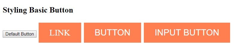
Let’s start with an example where we stylize a basic button:
<!DOCTYPE html>
<html>
<head>
<style>
.button {
background-color: #FF7F50;
border: none;
color: white;
padding: 15px 32px;
text-align: center;
text-decoration: none;
display: inline-block;
font-size: 26px;
margin: 4px 2px;
cursor: pointer;
}
</style>
</head>
<body>
<h2>Styling Basic Button</h2>
<button>Default Button</button>
<a href="#" class="button">LINK</a>
<button class="button">BUTTON</button>
<input type="button" class="button" value="INPUT BUTTON">
</body>
</html>
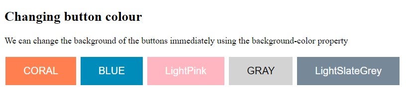
Adjusting Button Color
Now I will show you an example where we can change the color of the buttons, making them bolder.
<!DOCTYPE html>
<html>
<head>
<style>
.button {
background-color: coral;
border: none;
color: white;
padding: 15px 32px;
text-align: center;
text-decoration: none;
display: inline-block;
font-size: 18px;
margin: 4px 2px;
cursor: pointer;
}
.button2 {background-color: #008CBA;}
.button3 {background-color: LightPink;}
.button4 {background-color: LightGray; color: black;}
.button5 {background-color: LightSlateGrey;}
</style>
</head>
<body>
<h2>Changing button colour</h2>
<p>We can change the background of the buttons immediately using the background-color property</p>
<button class="button">CORAL</button>
<button class="button button2">BLUE</button>
<button class="button button3">LightPink</button>
<button class="button button4">GRAY</button>
<button class="button button5">LightSlateGrey</button>
</body>
</html>
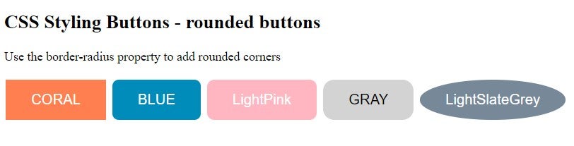
Border Radius
Now we will use border-radius property. Here is an example:
<!DOCTYPE html>
<html>
<head>
<style>
.button {
background-color: coral;
border: none;
color: white;
padding: 15px 32px;
text-align: center;
text-decoration: none;
display: inline-block;
font-size: 18px;
margin: 4px 2px;
cursor: pointer;
}
.button2 {background-color: #008CBA;}
.button3 {background-color: LightPink;}
.button4 {background-color: LightGray; color: black;}
.button5 {background-color: LightSlateGrey;}
.button1 {border-radius: 3px;}
.button2 {border-radius: 8px;}
.button3 {border-radius: 9px;}
.button4 {border-radius: 14px;}
.button5 {border-radius: 60%;}
</style>
</head>
<body>
<h2>CSS Styling Buttons - rounded buttons</h2>
<p>Use the border-radius property to add rounded corners</p>
<button class="button">CORAL</button>
<button class="button button2">BLUE</button>
<button class="button button3">LightPink</button>
<button class="button button4">GRAY</button>
<button class="button button5">LightSlateGrey</button>
</body>
</html>
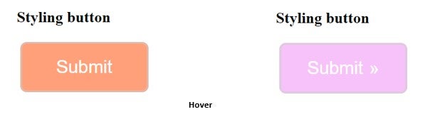
Hover
Now we will use the “hover” property to change the style of a button as the user moves the mouse over that button. You can also adjust the transition property to determine the speed of the “hover” effect.
<!DOCTYPE html>
<html>
<head>
<title>CSS Styling Buttons</title>
<style>
button {
display: inline-block;
background-color: LightSalmon;
border-radius: 10px;
border: 3px double #cccccc;
color: white;
text-align: center;
font-size: 28px;
padding: 20px;
width: 200px;
transition: all 0.5s;
cursor: pointer;
margin: 5px;
}
button span {
cursor: pointer;
display: inline-block;
position: relative;
transition: 0.5s;
}
button span:after {
content: '0bb';
position: absolute;
opacity: 0;
top: 0;
right: -20px;
transition: 0.5s;
}
button:hover {
background-color: #f7c2f9;
}
button:hover span {
padding-right: 25px;
}
button:hover span:after {
opacity: 1;
right: 0;
}
</style>
</head>
<body>
<h2>Styling button</h2>
<button>
<span>Submit</span>
</button>
</body>
</html>
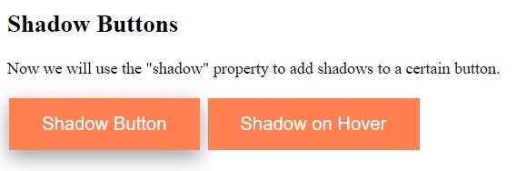
Shadow
Now we will use the “shadow” property to add shadows to a certain button. Here is an example:
<!DOCTYPE html>
<html>
<head>
<style>
.button {
background-color: CORAL;
border: none;
color: white;
padding: 15px 32px;
text-align: center;
text-decoration: none;
display: inline-block;
font-size: 18px;
margin: 4px 2px;
cursor: pointer;
-webkit-transition-duration: 0.3s;
transition-duration: 03s;
}
.button1 {
box-shadow: 0 8px 16px 0 rgba(0,0,0,0.2), 0 6px 20px 0 rgba(0,0,0,0.19);
}
.button2:hover {
box-shadow: 0 12px 16px 0 rgba(0,0,0,0.24),0 17px 50px 0 rgba(0,0,0,0.19);
}
</style>
</head>
<body>
<h2>Shadow Buttons</h2>
<p>Now we will use the "shadow" property to add shadows to a certain button.</p>
<button class="button button1">Shadow Button</button>
<button class="button button2">Shadow on Hover</button>
</body>
</html>
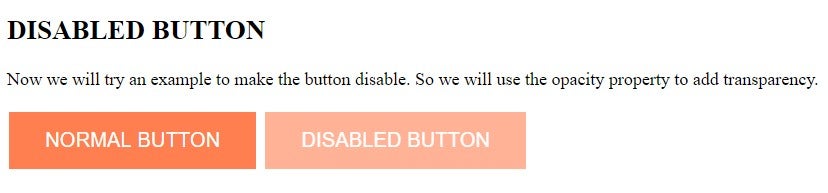
Disable a Button
Now we will try an example of how to disable the button. In this case, we use the opacity property to add transparency. We can also add the cursor property with an unmatched value, which will show a forbidden sign when you move the mouse over the button. Example:
<!DOCTYPE html>
<html>
<head>
<style>
.button {
background-color: CORAL;
border: none;
color: white;
padding: 15px 32px;
text-align: center;
text-decoration: none;
display: inline-block;
font-size: 18px;
margin: 4px 2px;
cursor: pointer;
}
.disabled {
opacity: 0.6;
cursor: not-allowed;
}
</style>
</head>
<body>
<h2>DISABLED BUTTON</h2>
<p>Now we will try an example to make the button disable. So we will use the opacity property to add transparency. </p>
<button class="button">NORMAL BUTTON</button>
<button class="button disabled">DISABLED BUTTON</button>
</body>
</html>
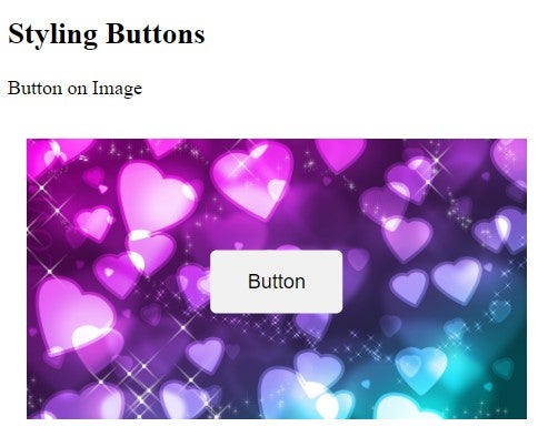
Button with a Background Image
Now we will show an example of how to add a background image to the button.
<!DOCTYPE html>
<html>
<head>
<style>
.container {
position: relative;
width: 100%;
max-width: 400px;
padding: 15px;
}
.container img {
width: 100%;
height: auto;
}
.container .btn {
position: absolute;
top: 50%;
left: 50%;
transform: translate(-50%, -50%);
-ms-transform: translate(-50%, -50%);
background-color: #f1f1f1;
color: black;
font-size: 16px;
padding: 16px 30px;
border: none;
cursor: pointer;
border-radius: 5px;
text-align: center;
}
.container .btn:hover {
background-color: black;
color: white;
}
</style>
</head>
<body>
<h2>Styling Buttons</h2>
<p>Button on Image</p>
<div class="container">
<img src="https://img.wallpapersafari.com/desktop/1920/1080/50/15/jdpDmE.jpg" alt="Snow" style="width:100%">
<button class="btn">Button</button>
</div>
</body>
</html>
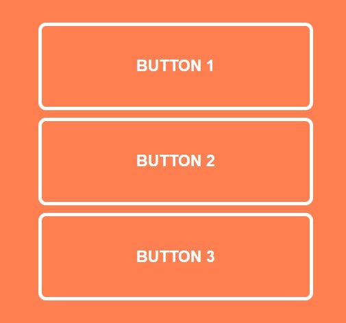
Using the Button Element
We will now create another example using the <button> element.
<!DOCTYPE html>
<html>
<head>
<title>CSS Styling Buttons</title>
<style>
body {
font-size: 80%;
background: CORAL;
}
.container {
padding: 50px;
}
button,
button::after {
-webkit-transition: all 0.3s;
-moz-transition: all 0.3s;
-o-transition: all 0.3s;
transition: all 0.3s;
}
button {
background: none;
border: 4px solid #fff;
border-radius: 10px;
color: #fff;
display: block;
font-size: 1.6em;
font-weight: bold;
margin: 10px auto;
padding: 2em 6em;
position: relative;
text-transform: uppercase;
}
button::before,
button::after {
background: #fff;
content: '';
position: absolute;
z-index: -1;
}
button:hover {
color: #29f2e4;
}
.button1::after {
height: 0;
left: 0;
top: 0;
width: 100%;
}
.button1:hover:after {
height: 100%;
}
.button2::after {
height: 100%;
left: 0;
top: 0;
width: 0;
}
.button2:hover:after {
width: 100%;
}
.button3::after {
height: 0;
left: 50%;
top: 50%;
width: 0;
}
.button3:hover:after {
height: 100%;
left: 0;
top: 0;
width: 100%;
}
</style>
</head>
<body>
<div class="container">
<button type="button" class="button1">Button 1</button>
<button type="button" class="button2">Button 2</button>
<button type="button" class="button3">Button 3</button>
</div>
</body>
</html>
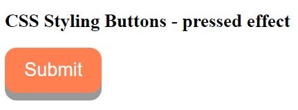
Animated Button
Now we will create an example with an animated button:
<!DOCTYPE html>
<html>
<head>
<style>
.button {
display: inline-block;
padding: 15px 25px;
font-size: 24px;
cursor: pointer;
text-align: center;
text-decoration: none;
outline: none;
color: white;
background-color: CORAL;
border: none;
border-radius: 15px;
box-shadow: 0 10px #999;
}
.button:hover {background-color: coral}
.button:active {
background-color: coral;
box-shadow: 0 5px #666;
transform: translateY(4px);
}
</style>
</head>
<body>
<h2>CSS Styling Buttons - pressed effect</h2>
<button class="button">Submit</button>
</body>
</html>
Conclusion
Hopefully you will enjoy exploring these various options for beautifying the buttons on your site.